The Ben-Day Dot Technique
Before halftone screening became universal, printers used a related but distinct technique called the Ben-Day process, named after its inventor Benjamin Henry Day Jr. Rather than photographically generating dots of varying size, the Ben-Day process used pre-printed sheets of dots, lines, or patterns at fixed sizes and densities. Printers would cut pieces of these sheets and apply them to specific areas of a printing plate to add shading or color. The technique was widely used in commercial printing from the 1870s through the 1960s, and it became the standard method for adding color and shading to comic books. Because the dots were uniform in size (rather than variable like halftone dots), they created a distinctively flat, graphic look. Areas of solid color could be modified by overlaying a dot pattern — for example, a solid red area overlaid with a Ben-Day dot pattern at 50 percent coverage would appear pink. This economical approach allowed comic book publishers to print in a full range of apparent colors using only a few ink colors.
Roy Lichtenstein and the Pop Art Movement
In the early 1960s, American artist Roy Lichtenstein transformed the humble Ben-Day dot from a commercial printing artifact into a defining element of fine art. His paintings — including Drowning Girl, Whaam!, and Oh Jeff — appropriated imagery from comic book panels and reproduced it at enormous scale on canvas, meticulously hand-painting the Ben-Day dot patterns that in the original comics were merely a mechanical printing necessity. By elevating these dots to the scale of gallery paintings, Lichtenstein forced viewers to confront the gap between high art and mass culture. The dots became a visual signature of the entire Pop Art movement, symbolizing the mechanical reproduction, mass media, and consumer culture that artists like Lichtenstein and Andy Warhol were simultaneously celebrating and critiquing. Today, the halftone dot pattern remains one of the most immediately recognizable visual motifs in contemporary design, carrying associations of retro aesthetics, pop culture, and graphic boldness.
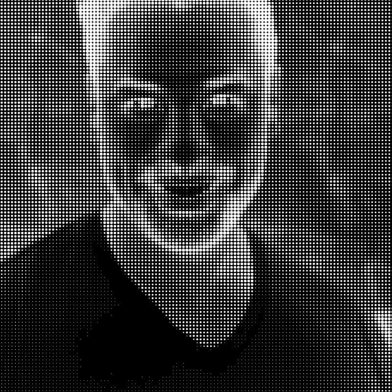
How the Digital Halftone Algorithm Works
This tool implements a digital halftone process that simulates the visual effect of physical halftone screening. The algorithm begins by converting the source image to grayscale. It then divides the image into a regular grid of square cells, with the cell size determined by the intensity setting. For each cell, the algorithm calculates the average brightness of all pixels within that cell, producing a single value between 0 (black) and 255 (white). It then draws a filled circle centered in the cell whose diameter is proportional to the darkness of the cell — darker cells receive larger dots, lighter cells receive smaller dots, and cells that are nearly white receive no dot at all. The result is a pattern of evenly spaced dots whose sizes vary to reproduce the tonal information of the original photograph. When viewed from a sufficient distance, the human visual system blends the dots together, perceiving continuous tonal gradation rather than individual circles. This perceptual blending is the same phenomenon that makes traditional printed halftones work — our eyes average the ink coverage over a small area and interpret the result as a shade of gray.
Dot Shapes and Their Visual Effects
While this tool uses circular dots (the most common and versatile shape), traditional halftone printing employs several dot shapes, each with distinct visual characteristics. Round dots produce smooth tonal transitions and are the standard choice for most applications. Square dots create a more geometric, mechanical appearance and provide slightly better tonal coverage in midtones because adjacent square dots merge sooner than round dots as they grow. Elliptical dots are a compromise — they merge along one axis before the other, producing a smoother transition through the midtone range and reducing the visual jump that occurs when adjacent round dots suddenly connect. Diamond-shaped dots create a distinctive pattern that some designers prefer for its decorative quality. The choice of dot shape subtly influences the mood and character of the printed image, and experienced designers select dot shapes deliberately to support their creative intent.
Screen Angles and Moire Patterns
In single-color halftone printing, the angle of the dot grid is typically set at 45 degrees because this orientation is least noticeable to the human eye — our visual system is most sensitive to horizontal and vertical patterns. In CMYK color printing, each of the four ink colors must be printed with its halftone screen at a different angle to prevent the dot patterns from aligning and creating distracting interference patterns called moire. The standard screen angles are 105 degrees for cyan, 75 degrees for magenta, 90 degrees for yellow, and 45 degrees for black. Yellow is placed at 90 degrees (the most visible angle) because it is the lightest ink and its dots are least noticeable. Black receives the premium 45-degree angle because it carries the most visual weight. Even with careful angle selection, moire can occur, and preventing it remains one of the persistent technical challenges of color printing. Stochastic (frequency-modulated) screening, which uses randomly placed dots of uniform size rather than a regular grid, eliminates moire entirely but produces a different visual texture.
CMYK Halftone Color Printing
Full-color halftone printing works by separating the original image into four channels — cyan, magenta, yellow, and black (CMYK) — and printing each channel as a separate halftone layer using its respective ink color. When all four layers are printed on top of each other, the overlapping transparent inks combine to produce the full range of visible colors. Where cyan and magenta overlap, they produce blue. Where cyan and yellow overlap, they produce green. Where magenta and yellow overlap, they produce red. The size of the dots in each color layer controls the intensity of that color's contribution to the final image. This subtractive color mixing is the foundation of virtually all commercial printing, from newspapers and magazines to packaging and billboards.
Halftone in Modern Design
Despite the transition to digital printing technologies that can produce continuous tones directly, the halftone dot pattern has become a deliberate design choice rather than a technical necessity. Graphic designers use halftone effects to evoke retro aesthetics in poster design, lending a vintage warmth to contemporary work. Album cover art across genres — from punk and hip-hop to indie rock — frequently incorporates halftone patterns as a stylistic element. Streetwear and fashion graphics draw heavily on halftone and Ben-Day dot motifs, connecting garment design to comic book and pop art visual culture. Event posters and concert flyers use bold halftone treatments to create eye-catching, screen-printable artwork. Editorial illustrations in magazines and newspapers sometimes use halftone effects deliberately to create visual contrast with the smooth digital photography that dominates modern publications.
Dot Size, Viewing Distance, and Resolution
The relationship between dot size and viewing distance is fundamental to how halftone images work. At close range, individual dots are visible and the image appears as an abstract pattern of circles. As viewing distance increases, the dots blend into continuous tone. The distance at which blending occurs depends on dot frequency — finer dot patterns blend at shorter distances. This principle has practical implications for choosing the right halftone parameters for your intended use. A poster viewed from across a room can use coarse, bold dots that create a dramatic graphic effect. A book illustration viewed at arm's length needs finer dots to achieve a smooth appearance. Social media images viewed on phone screens exist somewhere in between. When using this tool, consider where and how your output will be viewed and adjust the intensity slider accordingly.
Risograph and Screen Printing Applications
Halftone effects are particularly valuable for risograph and screen printing, two popular reproduction methods that share a common limitation: they print one ink color at a time and cannot produce continuous tones directly. Risograph printing, which has enjoyed a major creative renaissance in recent years, uses soy-based inks and a stencil-based process that produces one color layer per pass. Converting photographs to halftone patterns before printing allows risograph artists to reproduce photographic imagery using the medium's limited tonal capabilities. Similarly, screen printing (serigraphy) pushes ink through a mesh stencil and is inherently binary — ink passes through or it does not. Halftone preparation is therefore essential for any screen-printed design that requires tonal variation. Our tool produces output that is directly usable for both risograph and screen printing workflows.
Creating Editorial Illustrations with Halftone
Many editorial illustrators combine halftone effects with other graphic techniques to create distinctive visual styles. A common approach involves converting a photographic element to halftone and compositing it with hand-drawn or vector elements. This juxtaposition of photographic and graphic elements creates visual tension that draws the viewer's attention. Another technique involves applying halftone at different scales to different elements of a composition — fine dots for background elements and coarse dots for foreground subjects — to create a sense of depth and hierarchy. You can use this tool in combination with our line art converter or vintage engraving effect to create layered compositions that combine multiple visual treatments.
Using Halftone Effects in Web and Social Media Design
The halftone aesthetic translates effectively to digital contexts. Social media posts featuring halftone-treated portraits or product photos stand out in feeds dominated by smooth, high-resolution photography. Web designers use halftone patterns as background textures, hero image treatments, and hover-state effects. The bold graphic quality of halftone dots reads well at the small sizes typical of social media thumbnails and mobile screens. When preparing halftone images for digital use, keep in mind that screen rendering differs from print — dots that appear crisp on paper may develop slight aliasing artifacts on screen, so it can be worth experimenting with different intensity settings to find the sweet spot for your intended display context.
All processing runs entirely in your browser — your images are never uploaded. Free to use with no account required.