Halftone Dot Patterns: From Pop Art to Modern Design -- A Complete Guide
Look closely at a newspaper photograph from the twentieth century and you will see it: thousands of tiny dots, varying in size, arranged in a grid. Step back and those dots dissolve into a smooth image with convincing shadows, midtones, and highlights. This optical trick is called halftone, and it quietly shaped the entire history of printed media, comic books, and modern graphic design.
This guide covers everything you need to know about halftone -- from its origins in industrial printing to its role in fine art, how it works on a technical level, and how you can create halftone effects in your own projects today.
A Brief History of Halftone
The Printing Problem
Before halftone, printers faced a fundamental limitation. A printing press applies ink in a binary fashion -- ink or no ink, black or white. Reproducing a continuous-tone photograph on a press was essentially impossible. Early newspapers resorted to hand-engraved illustrations, which were expensive, slow, and only loosely faithful to their source material.
The breakthrough arrived in the 1880s when Frederic Ives developed a practical halftone screening process. By photographing an image through a fine mesh screen, he broke continuous tones into a pattern of dots. Large dots in dark areas, small dots in light areas, and medium dots in between. When printed and viewed at a normal reading distance, the human eye blends these dots into the illusion of smooth tonal gradation.
Ben-Day Dots
Around the same time, illustrator and printer Benjamin Day invented Ben-Day dots -- a related but distinct technique. While halftone dots vary in size to simulate tone, Ben-Day dots are uniform in size and spaced evenly. Tone is controlled by changing the spacing or by overlapping dot patterns in different colors. Ben-Day dots became the backbone of comic book coloring from the 1930s through the 1970s, producing those characteristic flat, vibrant fields of color with visible dot textures.
The distinction matters: halftone is a photographic reproduction technique; Ben-Day is a manual illustration technique. Both produce dot patterns, but their logic differs. In popular culture and modern design, the two are often conflated under the umbrella term "halftone."
Halftone in Art: Pop Art and Beyond
Roy Lichtenstein and the Elevation of Dots
No artist is more closely associated with halftone aesthetics than Roy Lichtenstein. In the early 1960s, Lichtenstein began painting enlarged reproductions of comic book panels, faithfully replicating the Ben-Day dot patterns at massive scale. Works like *Whaam!* (1963) and *Drowning Girl* (1963) turned a cheap industrial printing artifact into fine art, forcing viewers to confront the gap between mechanical reproduction and painterly expression.
Lichtenstein's work was central to the Pop Art movement, which also included Andy Warhol's silk-screened celebrity portraits. Warhol used actual halftone screens in his printing process, embracing the imperfections -- misregistration, ink bleed, uneven coverage -- as part of the aesthetic. Together, these artists established dot patterns as a visual shorthand for mass media, consumer culture, and ironic commentary.
Comic Book Aesthetics
Beyond fine art, halftone dots are inseparable from the golden and silver ages of American comics. Limited by primitive four-color presses, colorists used combinations of cyan, magenta, yellow, and black dot patterns at fixed percentages (25%, 50%, 75%) to create a palette of roughly 64 colors. This constraint produced the distinctive look that modern designers deliberately emulate when seeking a "retro comic" style.
How Halftone Works Technically
The Core Principle
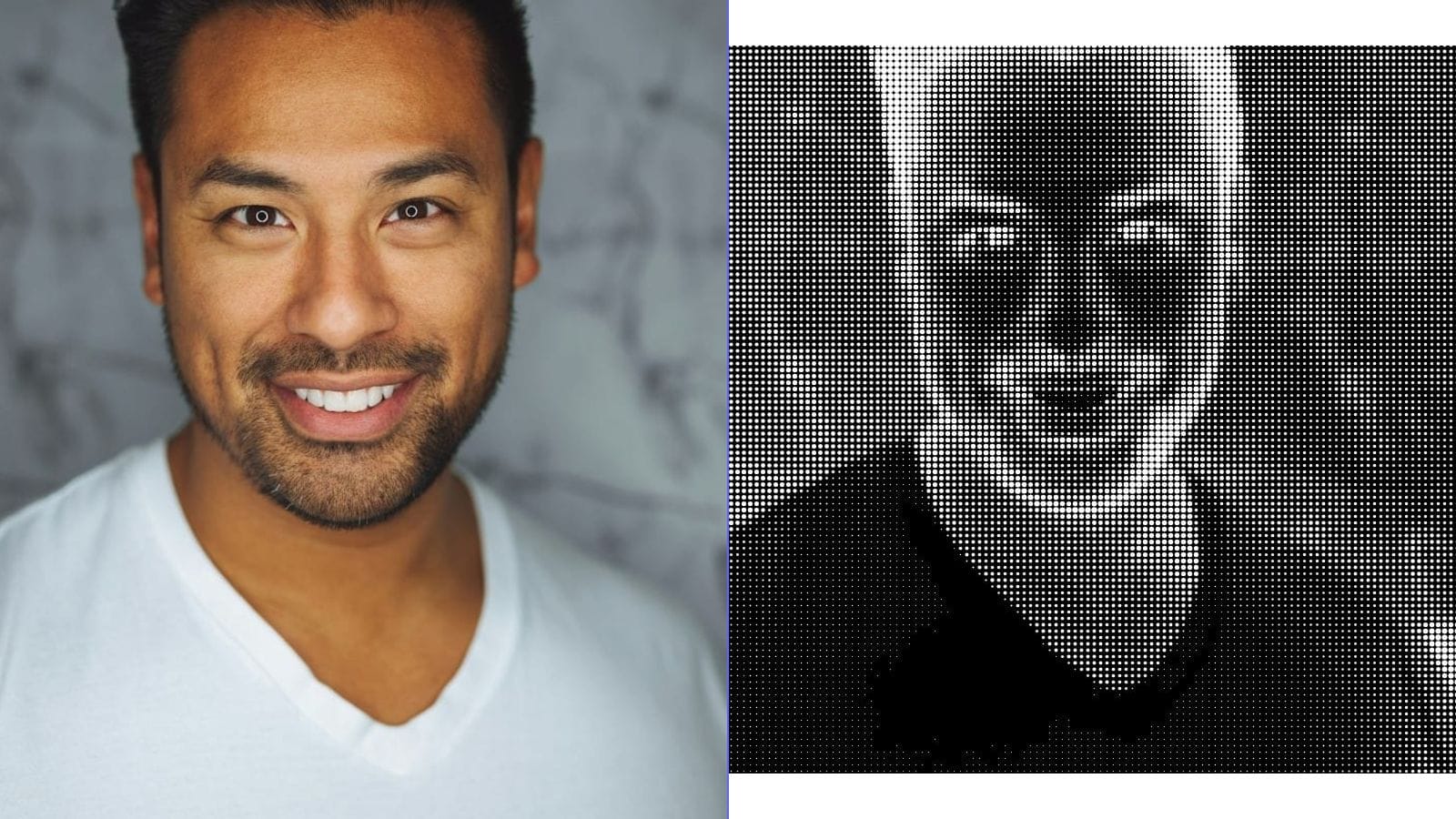
Halftone exploits a property of human vision: at sufficient distance, the eye cannot resolve individual dots and instead perceives their average tone. A cluster of large black dots on white paper appears dark gray; a sparse scattering of small dots appears light gray. This is called spatial integration.
Dot Size and Tonal Value
In a standard amplitude modulation (AM) halftone, dots are arranged on a fixed grid. Each dot occupies one cell of the grid. The tonal value of the original image at that cell determines the dot's size:
- Highlights (light areas): very small dots, lots of white space.
- Midtones: medium dots, roughly equal ink and paper.
- Shadows (dark areas): large dots that nearly merge, very little white space.
The line frequency (measured in lines per inch, or LPI) controls the grid density. Newspaper printing typically uses 85 LPI; magazine printing uses 133--175 LPI; fine art prints can reach 200+ LPI. Higher LPI means smaller, more closely spaced dots and smoother apparent tone -- but demands higher-quality paper and more precise press alignment.
Screen Angle
When printing in multiple colors (CMYK), each color's halftone grid is rotated to a different screen angle to prevent moire patterns -- distracting interference fringes caused by overlapping grids. Traditional angles are: black at 45 degrees, cyan at 105 degrees, magenta at 75 degrees, and yellow at 90 degrees. Getting these angles right is critical in professional printing; wrong angles produce muddy rosette patterns instead of clean color blending.
Types of Halftone Patterns
Not all halftone patterns use round dots. The shape and arrangement of the halftone element significantly affect the visual character of the output.
Round Dot (Classic)
The most common type. Produces smooth tonal transitions and is the default in most printing contexts. Midtones have a characteristic checkerboard quality where dots begin to touch.
Elliptical Dot
An elongated dot that transitions more smoothly through the midtone range. Preferred for skin tones and photographic work because it avoids the abrupt tonal jump that occurs when round dots begin merging.
Line Halftone
Instead of dots, tonal value is represented by varying the width of parallel lines. Creates a strong directional texture and an engraved, currency-note appearance. Popular for stylized portraits and editorial illustration.
Diamond and Square Dots
Geometric alternatives that produce harder, more graphic results. Square dots create a mosaic-like texture; diamond dots sit between round and square in character.
Stochastic (FM) Halftone
Unlike AM halftone (fixed grid, variable dot size), frequency modulation (FM) halftone uses dots of uniform size placed with variable spacing. Dense clusters of dots create dark tones; sparse dots create light tones. Stochastic halftone eliminates moire patterns entirely and can reproduce finer detail, but it demands very precise printing equipment and high-quality substrates.
Modern Uses of Halftone
Despite the shift to digital media, halftone patterns are more popular than ever as a deliberate design choice.
Poster and Graphic Design
Halftone overlays add texture, depth, and a retro sensibility to flat digital artwork. Designers layer halftone gradients behind typography, use dot patterns as shading in illustrations, or apply halftone fades to photographs for a screen-printed look.
T-Shirt and Screen Printing
Screen printing is inherently a halftone medium -- each color requires a separate screen, and photographic gradients must be converted to dot patterns. Understanding halftone is essential for anyone producing custom apparel. The typical screen printing LPI is low (35--65 LPI) because fabric cannot hold fine detail, which makes the dots visible and part of the aesthetic.
Retro and Vintage Aesthetics
The visible dot pattern immediately signals "vintage," "analog," or "handmade." Brands use halftone textures in packaging, social media graphics, and advertising to evoke nostalgia or to contrast with the clean perfection of digital design.
Street Art and Murals
Large-format halftone portraits have become a staple of street art. Artists project halftone-processed images onto walls and paint the dots by hand or with stencils. The effect is striking at close range -- abstract dots -- and resolves into a photographic portrait from across the street.
Converting Photos to Halftone
Digital Methods
Modern image editors and browser-based tools can simulate halftone effects in seconds. The general workflow is:
- Desaturate the image to grayscale (unless creating color halftone).
- Adjust contrast -- halftone works best with strong tonal range.
- Apply the halftone filter, setting dot shape, LPI or dot size, and screen angle.
- Export at high resolution for print or at screen resolution for digital use.
In Photoshop, the path is Filter > Pixelate > Color Halftone. GIMP offers a similar Newsprint filter under Filters > Distorts. For quick results without software installation, browser-based tools can handle the conversion entirely on your device.
Key Parameters to Understand
- Dot size / frequency: Controls how coarse or fine the pattern appears. Larger dots (lower LPI) look more graphic and stylized; smaller dots (higher LPI) look more photographic.
- Contrast: Low-contrast images produce a narrow range of dot sizes and look flat. Boost contrast before applying halftone.
- Dot shape: Round for general use, line for dramatic effect, stochastic for detail preservation.
Step-by-Step Guide Using Browser-Based Tools
Here is a general workflow for creating halftone art using any browser-based image processing tool:
Step 1 -- Choose Your Source Image. Portraits with strong lighting, high-contrast architectural shots, and bold graphic images work best. Avoid images that are flat, blurry, or overly complex.
Step 2 -- Crop and Compose. Decide on your final aspect ratio before processing. Halftone is unforgiving of clutter -- simplify the composition.
Step 3 -- Convert to Grayscale. Unless you specifically want color halftone (which requires separate CMYK channel processing), work in grayscale.
Step 4 -- Enhance Contrast. Push the histogram so that highlights are bright and shadows are dark. A levels or curves adjustment is ideal. The goal is a full tonal range from near-white to near-black.
Step 5 -- Apply Halftone Effect. Set your preferred dot shape and size. Start with a moderate dot size and adjust. Preview at both 100% zoom (to see the dots) and zoomed-out (to see the tonal image).
Step 6 -- Evaluate and Iterate. If shadows are clogged (dots merging into solid black), reduce contrast or increase dot size. If highlights are empty, the image may need more midtone information.
Step 7 -- Export. For print, export at 300 DPI minimum in a lossless format (PNG or TIFF). For web, PNG at screen resolution preserves the crisp dot edges that JPEG compression would destroy.
Design Tips for Better Halftone Results
Pick the right photo. Not every image translates well. Strong directional lighting, clear subject-background separation, and bold shapes produce the best halftone results. Soft, evenly lit images tend to look muddy.
Mind your dot frequency. Match dot size to output size. A poster viewed from three meters away can use very coarse dots (20--40 LPI). A postcard viewed at arm's length needs finer dots (60--100 LPI). Too fine, and the effect is invisible; too coarse, and the image becomes illegible.
Use halftone as a layer, not a replacement. In design compositions, halftone works powerfully as a texture overlaid on solid colors or combined with line art. It does not always need to carry the entire image.
Experiment with color. Printing halftone dots in a non-black ink color -- deep blue, warm red, sepia -- on tinted paper creates rich, distinctive results that go beyond simple black-and-white.
Printing Considerations for Halftone Artwork
If you intend to physically print halftone work, several practical factors matter:
- Paper stock: Uncoated paper causes dot gain (dots spread as ink absorbs into fibers), making the image appear darker. Compensate by using slightly smaller dots or lighter midtones. Coated stock holds dot shape precisely.
- Printing method: Offset lithography reproduces halftone faithfully. Inkjet printers apply their own internal halftoning, which can conflict with your pre-halftoned image -- print at the highest quality setting with no additional screening. Laser printers handle halftone well at 600+ DPI.
- Resolution: Your file resolution must be at least 1.5 to 2 times the halftone LPI to accurately define dot edges. For 100 LPI halftone, use at least 200 PPI file resolution.
- Proofing: Always print a test at actual size before committing to a full run. Halftone effects can shift dramatically between screen and paper.
Creative Project Ideas with Halftone Effects
- Pop art portrait series: Convert photos of friends or family into bold halftone portraits, print on bright-colored card stock, and frame as a set.
- Screen-printed posters: Design a concert or event poster using halftone gradients behind hand-lettered typography.
- Custom stationery: Apply a subtle halftone texture to letterheads or business cards for a tactile, vintage feel.
- Mixed-media collage: Combine halftone-printed photographs with hand-drawn elements, paint, or found materials.
- Textile design: Create repeating halftone patterns for fabric printing -- the dot pattern doubles as both image and texture.
- Social media graphics: Use halftone overlays to add depth and visual interest to flat digital designs, distinguishing your content from the typical clean aesthetic.
Frequently Asked Questions
What is the difference between halftone and dithering?
Both convert continuous tones to binary patterns, but they use different strategies. Halftone arranges dots on a regular grid with varying sizes. Dithering (such as Floyd-Steinberg) distributes error across neighboring pixels to create irregular dot patterns. Halftone has a structured, graphic look; dithering appears more organic and noise-like.
Can I create halftone effects without Photoshop?
Yes. GIMP (free, open-source) has a Newsprint filter. Inkscape can generate vector halftone patterns. Many browser-based image tools offer halftone conversion that runs entirely in your browser with no software installation required.
What resolution should my source image be?
For print output, start with at least 300 DPI at your target print size. For screen use, your source image should be at least as large as your intended display size. Higher resolution gives the halftone algorithm more tonal information to work with.
Why does my halftone print look different from my screen?
Screens emit light; paper reflects it. Dots that appear crisp on screen may gain (spread) on paper, especially on uncoated stock. Additionally, your monitor may display a wider tonal range than your printer can reproduce. Always proof on your target paper stock.
Is halftone only for black-and-white images?
No. Full-color halftone separates an image into CMYK channels, each printed as a halftone pattern at a different screen angle. The overlapping colored dots blend optically into a full-color image. You can also create striking duotone or tritone halftones using two or three ink colors.
What dot size should I use for screen printing?
For standard textile screen printing, 35--55 LPI is typical. Finer meshes on smooth fabrics can handle up to 65 LPI. Always consult with your screen printer about their equipment capabilities before finalizing your artwork.