Why Image Placeholders Matter in Wireframe Presentations
The humble image placeholder is more important to wireframe effectiveness than most people realize. When a wireframe contains an actual photograph, it fundamentally changes how viewers respond to the design. Their eyes are drawn to the photographic content, and their feedback shifts from structural critique ("should this section be above or below the fold?") to content critique ("I don't like that particular photo" or "shouldn't the person be smiling?"). This is counterproductive during the structural design phase. Pure gray boxes with an X through them solve this problem but create a different one — they give no sense of the intended content type, making it difficult for stakeholders to judge whether the layout will work when populated with real imagery. Line art placeholders occupy the ideal middle ground. They communicate the intended composition and subject matter (a landscape, a product shot, a portrait) while maintaining the low-fidelity aesthetic that keeps feedback focused on structure. This converter generates exactly that kind of placeholder from your reference photos.
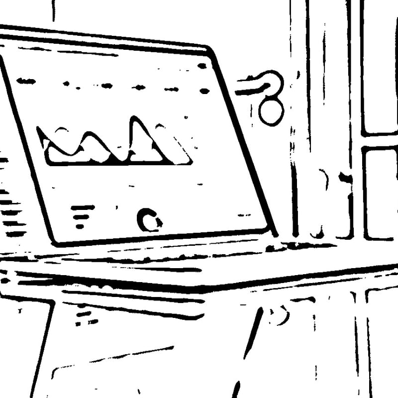
How the Adaptive Threshold Algorithm Creates Clean Line Art
The conversion engine uses adaptive thresholding to transform photographs into clean, minimal line drawings suitable for wireframe contexts. Unlike a global threshold that applies a single brightness cutoff to the entire image, adaptive thresholding calculates a separate threshold for each local neighborhood of pixels. The algorithm examines a window around each pixel, computes the mean or weighted mean brightness of that neighborhood, and determines whether the pixel is above or below the local average. Pixels that are significantly darker than their surroundings become black; everything else becomes white. This local approach handles photographs with uneven lighting gracefully — a product photo with a bright highlight on one side and shadow on the other will still produce clean, consistent line art throughout. Before thresholding, the image passes through a smoothing filter that suppresses fine texture and photographic noise, ensuring that the output contains only meaningful structural edges. The result is a crisp line drawing with pure white backgrounds and clean black lines that integrate seamlessly with standard wireframe visual language.
Wireframe Design Principles
Effective wireframes follow several established design principles that guide layout decisions. Grid systems provide the structural foundation — most wireframes are built on a 12-column grid (or variant) that establishes consistent alignment and spacing across elements. The grid ensures that components align vertically and that the layout scales predictably across different screen sizes. Visual hierarchy determines how the eye moves through the page, established through element size, position, and spacing. The most important content should be the most visually prominent, typically larger and positioned near the top of the page. Whitespace — the empty areas between and around elements — is not wasted space but an active design tool that groups related content, separates distinct sections, and gives the eye resting points. Consistency in element sizing and spacing creates rhythm and predictability, helping users build mental models of how the interface works. Wireframes that violate these principles often produce interfaces that feel chaotic or confusing, even when the visual design layer is beautifully executed.
Standard UI Components and Patterns in Wireframes
Wireframes are composed from a vocabulary of standard UI components that represent common interface elements. Navigation bars, headers, and footers provide the structural frame of the page. Content cards group related information — typically an image, title, description, and action — into a modular unit that can be repeated and rearranged. Hero sections combine a prominent image with a headline and call-to-action, serving as the primary visual entry point for landing pages. Form elements — text inputs, dropdowns, checkboxes, radio buttons, and submit buttons — represent user input areas. Modal dialogs, tooltips, and drawers handle secondary interactions and supplementary content. Breadcrumbs, pagination, and tab bars provide navigation within content hierarchies. Each of these components has established conventions for sizing, spacing, and behavior that users have learned through years of web and app usage. Wireframes that respect these conventions produce interfaces that feel intuitive; those that deviate should do so intentionally and with clear justification.
The Tools Ecosystem for Wireframing and Design
The landscape of wireframing and design tools has evolved significantly over the past decade. Figma has become the dominant collaborative design tool, offering real-time multiplayer editing, component libraries, and prototyping capabilities in a browser-based application. Its wireframing capabilities are flexible — designers can work at any fidelity level using the same tool, and community-created wireframe kits provide ready-made component libraries. Sketch, the macOS-native design application, pioneered many concepts that Figma later adopted and remains popular among designers in Apple-centric workflows. Adobe XD offers tight integration with the broader Adobe ecosystem, making it a natural choice for teams already using Photoshop and Illustrator. On the lower-fidelity end, Balsamiq deliberately mimics hand-drawn sketches, enforcing a rough aesthetic that keeps discussions focused on structure. Whimsical combines wireframing with flowcharts and mind maps, making it well-suited for early-stage ideation. For quick hand-sketched wireframes, tools like GoodNotes or Concepts on tablets provide a natural drawing experience. This converter complements all of these tools — generate your line art placeholder, download the PNG, and place it directly into any wireframe composition regardless of the tool you use.
The Designer's Workflow from Research to Wireframe to Prototype: A typical UX design workflow moves through several phases, each building on the previous. It begins with research — understanding user needs through interviews, surveys, analytics review, and competitive analysis. The insights from research inform information architecture decisions: what content and features the product needs and how they should be organized. Card sorting and tree testing exercises help validate the proposed structure. From there, designers create user flows — diagrams showing the paths users take through the interface to accomplish their goals. These flows identify which screens are needed and how they connect. Wireframing translates user flows into spatial layouts. Designers work through multiple iterations, often starting with quick paper sketches before moving to digital wireframes. Usability testing on wireframes — even rough ones — reveals structural problems before visual design investment. Once wireframes are validated, they progress to high-fidelity mockups with visual design applied, then to interactive prototypes that simulate the real product experience for final validation before development begins. Image placeholders from this converter are most valuable during the wireframe-to-mockup transition, when layouts need to communicate intended imagery without the visual weight of final photography.
Presenting Wireframes to Stakeholders
How you present wireframes significantly affects the quality of feedback you receive. Begin by setting expectations: explain that wireframes show structure and layout, not visual design. Explicitly state that colors, fonts, and imagery are not yet decided. Walk through the wireframe in the context of a user story or task flow rather than presenting it as a static layout — "the user lands on this page, sees the hero content here, scrolls down to find these options, clicks this button to proceed." This narrative approach keeps stakeholders focused on whether the design supports the user's journey. Annotate wireframes with brief notes explaining non-obvious decisions — why a particular element is positioned where it is, what content will populate a section, what interaction occurs when a button is pressed. Use line art image placeholders rather than gray boxes to help stakeholders envision the final page without being distracted by specific photographic content.
Common Wireframing Mistakes to Avoid
Several recurring mistakes undermine wireframe effectiveness. Using too much detail too early is perhaps the most common — when wireframes look too polished, stakeholders treat them as final designs and provide visual feedback rather than structural feedback. Designing for a single screen size without considering how the layout adapts to other breakpoints leads to painful responsive design problems later. Ignoring content strategy — using "lorem ipsum" placeholder text when real content length and type significantly affect layout decisions — creates wireframes that look clean but fail when populated with actual content. Skipping user flows and jumping directly into wireframe layouts produces pages that work in isolation but create confusing navigation when assembled into a complete product. Finally, not involving developers early enough means wireframes may propose layouts or interactions that are disproportionately expensive to implement.
Responsive Design Considerations in Wireframing
Modern interfaces must work across a wide range of screen sizes, from large desktop monitors to small phone screens. Responsive wireframing addresses this by defining how the layout adapts at different breakpoints. Common breakpoints include desktop (1200px and above), tablet landscape (1024px), tablet portrait (768px), and mobile (375-428px). At each breakpoint, wireframes should show how elements reflow: a three-column desktop layout might become a single column on mobile, navigation might collapse into a hamburger menu, and image placements may change from side-by-side to stacked. The line art placeholders generated by this converter are useful here too — the same placeholder can be cropped or resized for different breakpoints while maintaining its schematic quality.
Accessibility in Wireframe Planning
Accessibility should be considered from the earliest wireframe stage, not retroactively applied to finished designs. Wireframes should account for logical reading order that makes sense when content is linearized for screen readers. Interactive elements need sufficient size for touch targets (at minimum 44x44 points per WCAG guidelines). Color should not be the sole means of conveying information, a principle that the grayscale nature of wireframes naturally enforces. Form fields need space for visible labels (not just placeholder text, which disappears when the user begins typing). Error messages need designated locations near the elements they describe. Planning for these accessibility requirements in wireframes prevents costly redesigns when accessibility audits occur later in the development cycle.
Design System Integration
As organizations mature their design practices, they increasingly adopt design systems — documented collections of reusable components, patterns, and guidelines that ensure consistency across products and teams. Wireframes should reference the organization's design system components rather than inventing new element styles. This alignment means wireframes translate more directly into implementable designs, since developers can map wireframe elements to existing coded components. When wireframing with design system components, image placeholders should match the aspect ratios and sizing conventions defined by the system. For instance, if the design system specifies that product cards use 4:3 images and hero banners use 21:9, generate your line art placeholders at those ratios so the wireframe accurately represents how the final layout will proportioned. For other conversion needs in your design workflow, you may also find our general line art tool or avatar maker useful for generating profile picture placeholders.
All processing runs entirely in your browser — your design concepts, reference photographs, and project materials are never transmitted to any server. This privacy guarantee is especially important for teams working on products that have not yet been publicly announced. The tool is completely free, with no sign-up required and no limitations on usage.